Wednesday, October 29, 2014

DIY Kate Spade Inspired Champagne Flutes


In the last year, my obsession with anything gold has progressively grown. Gold jewelry, gold monograms and especially gold home accents. With my liquid gold leaf and my gold leaf pen, I have been doing so many little DIY projects here and there and I thought it was finally time to document one of them for you!


Kate Spade Dotted Mug
I had a couple of champagne flutes leftover from a brunch that we had for my roommate that is getting married next May (yayy!). The flutes were just from the Dollar Tree, so literally they were $1 apiece. I did a personalized flute for everyone that was there as a favor and they turned out super cute! But a couple of girls accidentally left theirs behind so we were left with 2 personalized flutes that weren't our initials; so I had to change that! Luckily the gold leaf pen came off easily with nail polish remover and I was left with a blank canvas on the flutes. The inspiration was actually from a Kate Spade dotted mug I have seen on Pinterest (pictured above). I love how the dots are just placed pretty randomly so it doesn't look so uniform. I used this as a basis to get started on the dots on mine!


Liquid Gold Leaf in Classic gold, Q-tips, and Dollar Tree Champagne Flutes
This tutorial is truly extremely simple. The only supplies that you need are shown above. The Liquid Gold Leaf is just from my local Michael's store. If you are a crafting regular, you know that Michael's always has a coupon for 40-50% off any one item. So, don't ever go in there to buy one thing and pay full price. Just pull it up on your phone and they will scan the coupon from there. This stuff is only around $6 for this container, and I know it seems small but a little goes a long way. I probably have had this for a year and it isn't even halfway gone. And I have used it on multiple projects!!  Obviously, the Q-tips could come from absolutely anywhere, and the champagne flutes are just from my local Dollar Tree.


To do the dots, just dip the tip of your Q-tip into the liquid gold leaf until just the tip is wet with the paint. That should be plenty of product to make a solid, opaque dot. As far as the placement of the dots, I wanted mine to be more concentrated towards the base of the glass.  As you can see in the above picture, I just randomly placed dots (much closer together at the base) all over and even overlapped a couple towards the bottom.  As the dots moved up the glass, I spaced them further and further apart.


The beauty of this, and really what makes it so easy- is that there is no real pattern to it! This means that there's no wrong way to place your dots, so don't be afraid of messing up! :) As I moved up the glass I left more space and even had a couple on each glass that lined up right at the lip of the glass. But just one or two of those per glass. Each dip of the Q-tip would get me around 2 solid dots. Some dots may not be as opaque as you prefer if there is not enough paint on the Q-tip. To touch those up, just wait until the dots have dried fully (otherwise it just makes it worse) and re-dot the same area.

I did need a new Q-tip after I did my first glass, so if it is getting messy or not producing as clean of a circle, just get yourself a new Q-tip! I just used two for both of these glasses. The pictures below are of the finished product! I really am so happy with how they turned out, they are the perfect addition to my gold bar cart.


Had to add a little pink champagne so you could get the full effect :)


CHEERS!


And there you have it! Probably the most simple tutorial of all time, but the end result is fabulous! Obviously this dotted look would also look adorable on any other type of glass or even a plate or something for jewelry storage! And just one helpful tip- I would recommend hand washing these just to avoid flaking of the paint. It should be pretty stuck on there, but hand washing would definitely help it not chip! Hope you all enjoyed this and please share your own projects if you do attempt it!

Until next time...

Catherine
CHIC.CLASSY.CHEAP


Saturday, March 1, 2014

DIY Ikea Hack: Dorothy Draper Inspired Rast Dresser

Hi all!  I know it's been forever and a day since I have posted on here and I have no excuse. Life just gets in the way of things sometimes :)  Anyway, I just finished something I had been daydreaming about doing for about the last 6 months and it turned out better than I could have even hoped for.  I am so excited about it, I am inspired to finally do a DIY post on here!  So check out the my tutorial below and please - share if you try this yourself!! I love seeing the different tweaks that people make to make something their own.

PS- This is not an 'original' idea of mine.  I had been researching "Ikea Rast hacks" for a while and kind of combined a couple of different ideas to come up with what I did. This Honey & Fitz  dresser was what made me finally decide to go with pink and gold, and this Marcus Design hack made me realize I could get the same effect of the o'verlays without having to shell out $60 by creating a simple stencil.

To start out, I bought the Ikea Rast dresser for $35 while I was up in Cincinnati visiting my mom and sister. Ikea has so many things that are plain and leave room for creativity and customization, and I love that about them.  Plus, their stores are like my HEAVEN (enter angel noises..)

Next, I had to find the hardware.  The simple brass pulls that most of the tutorials used were just kind of expensive.  Since the dresser itself was only $35 and I didn't really know if it was going to turn out amazing, I didn't really want to spend a heck of a lot on 6 dresser pulls. So I found an alternative, see the lion pulls  from Home Depot for $1.89 apiece below.


I wasn't crazy about the coloring - the blackish bronze was really just kind of ugly, but I knew I could fix it.  I picked up some liquid gold leaf and a gold leaf pen - both from Michael's.  I read good things about both products, and was able to use coupons- so they were both under $6. I used the liquid gold leaf to paint the drawer handles gold.  


The process was really simple!  And after one quick coat, (this stuff dries fast!) they looked like the above.  I went ahead and did about 3 coats on each, mainly because it dried so fast and because it was really simple.  I probably could have gotten away with just two.  After I painted my knobs, I am not going to lie- this project was on a hiatus.  I could never seem to find the time to build the dresser and start the painting/priming process. Plus it's just been such a cold winter - it's made me not want to do ANYTHING. 


Finally, last weekend there was a random 60 degree, sunny day.  And I realized - this is my chance to knock this out.  I went home and built the shell of the dresser and put the drawers together.  I then did a very light coat of a "2x the strength" primer.  Some of the tutorials I read said you have to use a primer because you are starting with raw wood, and then others did not.  So I kind of landed in the middle and did one light coat of a primer.


As for the pink paint - I had this paint left over from an accent wall I previously did in my last apartment.  This is just "Colorplace" flat interior wall paint in a coralish-pink color.  I have no idea what the name is.  Colorplace paint is actually sold at WalMart - and it's amazing. It's like $11 for a gallon and it really is GOOD paint.  It covers well and they will make any color you want. 
*Recommendation- I used flat paint only because that's what I had on hand.  If you are buying paint specifically for this project, I would get something with a gloss to it.  I quickly realized I didn't love the chalky finish and I had to go back to the store to get something to put a glaze on mine.


I bought one of those small foam rollers for like $4 or $5 at WalMart and used that to roll on the pink on the body and the drawers of the dresser.  It took me 3-4 solid coats to get the color to be as opaque as I wanted it to be.  When I wrapped up that day, I had the product below. (I was so excited with how cute it was turning out, I decided to put on the lion pulls to take a picture to send out to my friends and family. I took them back off when I started working on it again.)

As I mentioned in my recommendation above, I then decided I wasn't crazy about the look of the flat paint on the dresser.  I went back to the store to get something to put a glossy finish on top of the paint.  At first, I thought I would do a layer of polycrylic.  Turns out- polycrylic is like $20 for a small little can.  I thought that was ridiculous, so I decided on the crystal clear enamel spray paint from Rustoleum.  It said it was great for sealing and producing a glossy finish, which is exactly what I wanted.  And it was less than $4 for the can.  

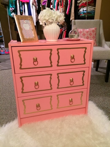
I sprayed the entire dresser (NOT THE PULLS!) with a couple coats of the clear gloss.  It was exactly what I wanted- took away that chalky look and feel and made it look more polished.  The next step was getting the o'verlays shape on to the drawers.


I basically went to the O'verlays site and searched for the "DeeDee" overlay and then copied and pasted that image into a word document.  I then made it the correct size (around 6.125 x 10.125) by just formatting the picture and adjusting the measurements. I then printed out that image and CAREFULLY cut out the shape (making sure to leave the links in the middle so that it stayed together).  A picture of my used stencil is above. 


To fill in the stencil on my dresser, I used my Krylon gold leafing pen.  Again, this was from Michael's. I laid the stencil on the bottom drawer and really just eyeballed it with the hole for where the knob was going. I didn't even tape my stencil down - I realized as long as you keep a steady grip on it as you are tracing the lines, it won't go anywhere.


After I finished the first two stencils, I was so excited I had to stop and admire my work for a second and take a photo.  I then stayed up way past my bedtime on a weeknight and decided to knock all of the stenciling out because I was so excited to see the end result. I put all my knobs on. I screwed them in and also superglued them down to the drawer itself, because the screws were a little bit too long and they were wobbly if I didn't. I am sure you could get shorter screws at Home Depot, but who the heck wants to go out and do that at midnight on a random Thursday? Not me :)

Anyway, below is the final result.  I quickly set a few things on top just to mock style it because it was so darn cute and I wanted to take some pictures of it for the blog.  I am not sure of where it's real home is going to be and what exactly will be sitting on top of it, but I can tell you - it's going to be pretty wherever it ends up!


Thank you guys for reading, and I hope this was helpful! Please share your link or picture if you do end up trying this out - I love seeing that I have inspired creativity :) Don't forget to share me on Pinterest if you like what you see! Until next time...

Catherine
Chic.Classy.Cheap

Monday, October 7, 2013

Styling a bookcase

I have been looking for the 'perfect' white bookcase for a few months now.  To make a long story short, I could not find one that I was happy with.  I came across this Threshold bookshelf at Target and thought I would give it a shot.  I ended up getting it on sale (I think it was $92 and I used my Target card so I didn't pay shipping) and figured I would try and spruce it up on my own.

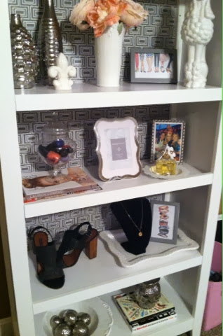
The quality of the bookshelf itself is actually really nice, it is well built and much bigger than I thought it was going to be.  Threshold for Target really has been kicking ass lately.  If you haven't checked their furniture/decor stuff out, you should. The best part is that the bookcase is truly white- not cream like lots of things turn out being.  Anyway,  I had bought some grey and white patterned transfer paper from TJ Maxx a while back (it was only $5.99 for two rolls) and I decided to put it to good use for this project. 

I applied the transfer paper to the back of the bookcase before I attached it to the bookcase itself.  It is a little bit tedious, but I realized that a few bubbles really weren't going to be noticeable once I had the shelves filled with things.

I will say this upfront: there is no specific method to getting a bookcase 'styled' correctly.  I have worked/reworked this one at least 5 times in the time that I've had it and I still don't feel like it's perfect. You want to take it one shelf at a time- don't worry about the big picture until you've gotten an idea of what you want on each shelf specifically. This process takes a lot of time/patience and a lot of STUFF!  
Here are some tips for filling your bookcase:

You want to find things that are going to mesh well together, so you may want to pick a color scheme.  Since the background of mine was grey and white, I wanted to mainly find things that were silver/grey or white with some touches of pink (a girly girl can never stray from pink).  I threw a couple of things in that were black but for the most part, I stayed within my scheme.  Also, you want to buy things that are different shapes and sizes.  Different sized picture frames, apothecary jars, vases, books, etc. If everything looks the same, you are going to have one boring bookshelf on your hands. You are going to want to stagger pieces, and this part just takes practice and patience.  You really will spend a couple of hours moving things around, stepping backwards and really looking at it, and then moving things around again.  I got a lot of the stuff on my bookshelf from TJ Maxx, Marshall's and Homegoods- but then other things are really just random (shoes, pictures I printed, fleur de lis salt shaker...) so really, you should just keep an eye out for anything that catches your eye wherever you may be!

My camera is officially broken, so now I have no choice but to only use my phone to take pictures, so I will say that these pictures of the bookshelf do not even come close to doing it justice.  But hopefully you all will get the gist of it and maybe get inspired or get ideas for your own bookcase that you may be working on.  

I hope you all enjoy this post and please let me know if you have any questions for me!  


Saturday, July 6, 2013

Instagram Lovin'

I knoooow, I know.  I haven't updated in forevvvver.  I am probably the worst blogger ever.  But I wanted to just stop in and share some of my fave photos from my instagram @cboccieri to give you all a little glimpse into my life the past few months.  Hope everyone is doing well and enjoying the summer.  I know I am! :)
Wilson's first bath!

My handsome boy beggin' for chicken
Kentucky state necklace from Etsy

Kate Spade quilted bag


Shake Shack in DC!

Bonefish brunch...yummmmm

arm candy fo dayzzz

DIY american flag shorts!

The newest love of my life. 

Hopefully you all enjoy!